
Storefront display
Grid
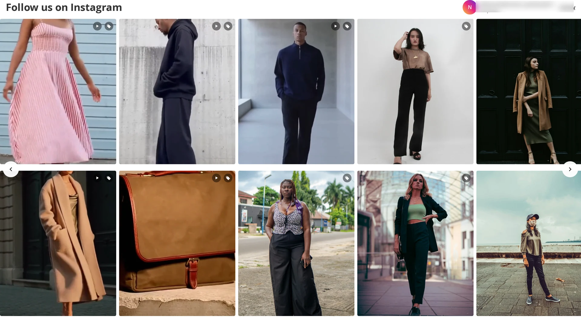
Tiles in a responsive grid, using your column counts (or Auto mode's minimum tile width). Hovering a tile fades in the Instagram glyph — a link to the post when that setting is on.
Optional overlays: caption, username, like and comment counts, and a tag badge when the post has products.
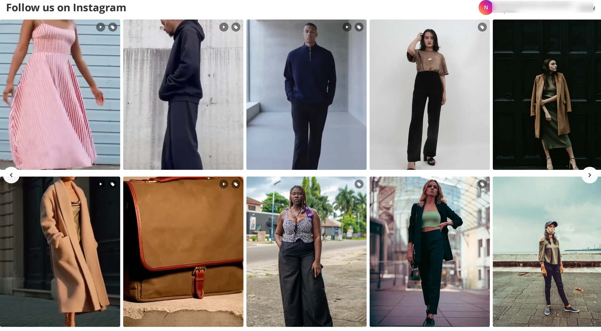
Slider
A horizontal track with arrows, snap points, and click-and-drag scrolling on desktop. Touch devices scroll natively with momentum. The next tile is deliberately left part-visible so shoppers know the row continues.
Popup
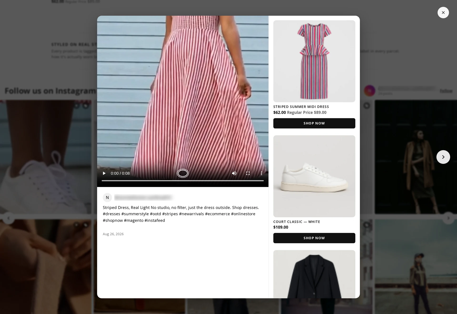
Clicking a tile opens the shoppable popup — the browser's native dialog, which means:
- focus moves into the popup and returns to the tile you opened it from
- Escape closes it
- Tab and Shift+Tab stay inside
- arrow keys move between carousel slides
It shows the media, optional caption, date and permalink, and the product cards with Add to Cart.
Video
Video tiles show a play indicator. With Autoplay Video on, video plays muted when it scrolls into view, and only one plays at a time.
Mobile
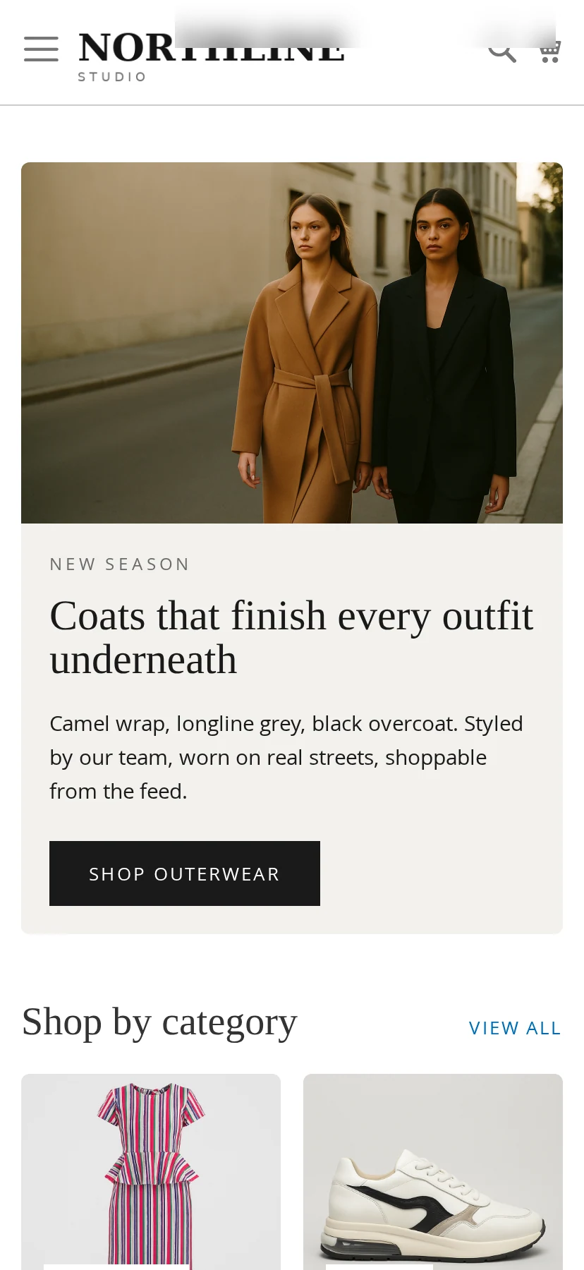
Column counts switch at the theme's own breakpoints, so a four-column desktop grid becomes the two columns you set for mobile. Sliders scroll with native touch momentum and keep their arrows for anyone using a pointer.
Swipe between posts. The popup's previous and next controls are hidden on narrow screens, so a horizontal swipe across the photo moves to the neighbouring post instead. A swipe has to travel about 15% of the width to commit — a shorter drag springs back, and a mostly-vertical gesture is left to the page so the popup can still be scrolled and dismissed. Pointer, keyboard and the on-screen arrows keep working unchanged on desktop.
Accessibility
- Alt text comes from the caption, with emoji and control characters stripped and the text trimmed to a readable length; posts with no caption get a localized fallback.
- The hover link carries an explicit label — View this post on Instagram (opens in a new window).
- Video tiles do not expose a hidden focusable link.
- Focus states are visible on tiles, arrows and popup controls.
SEO
Each tile emits application/ld+json structured data, so crawlers can read the gallery. Images carry width and height, so the page does not shift while they load.
Without JavaScript
The gallery is server-rendered: tiles, images, captions and links all work. Only the popup, slider drag, batched reveal and analytics need JavaScript, and their absence degrades quietly rather than breaking the page.
Performance
- The feed block is fully page-cacheable.
- Product data loads only when a popup opens.
- Images are lazy-loaded below the first row, with
srcsetfor the right size. - No jQuery, no framework — a few small vanilla modules.