
Design & layout
All of these live on the feed itself (Instagram Feed → Feeds → Edit), so two feeds on one store can look completely different.
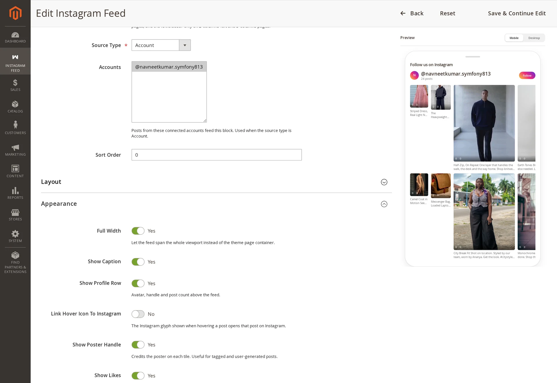
Layout
| Setting | Options | Default |
|---|---|---|
| Layout | Grid, Slider, Masonry, Highlight | Grid |
| Column Mode | Fixed column counts, Auto (fit to minimum tile width) | Fixed column counts |
| Columns (Desktop) | 1–8 | 4 |
| Columns (Tablet) | 1–6 | 3 |
| Columns (Mobile) | 1–4 | 2 |
| Minimum Tile Width (px) | 80–600 px (Auto mode) | 220 px |
| Rows | number | 2 |
| Post Limit | 1–100 | 12 |
| Full Width | on / off | on |
| Show "View More" Button | on / off | off |
Auto column mode fits as many tiles as the space allows, using Minimum Tile Width — useful when the feed sits in containers of varying width.
Choosing a layout
| Layout | What it does | Use it when |
|---|---|---|
| Grid | Even rows and columns, every tile cropped to the same Aspect Ratio. | The feed sits in a page section and should look orderly. |
| Slider | One horizontal row with arrow controls; the next tile peeks in at the edge. | Space is tight, or the feed sits between other content blocks. |
| Masonry | Columns of varying heights. Each post keeps its own proportions instead of being cropped. | Portrait and landscape posts are mixed and cropping loses the subject. |
| Highlight | The first post leads at double width and height; the rest flow around it. | One post matters more than the others — a campaign shot or a launch. |
Aspect Ratio has no effect under Masonry — keeping each post's own height is the point of that layout, so the setting is ignored rather than applied.
Show "View More" Button renders every post but reveals them in batches behind a button. Without JavaScript the shopper simply keeps the whole feed.
Appearance
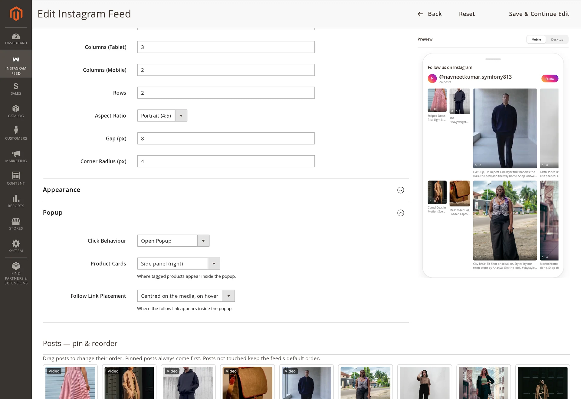
| Setting | Options | Default |
|---|---|---|
| Aspect Ratio | Square (1:1), Portrait (4:5), Story (9:16), Original | Portrait (4:5) |
| Gap (px) | px | 8 |
| Corner Radius (px) | px | 0 |
| Link Hover Icon To Instagram | on / off | on |
| Show Caption | on / off | off |
| Show Poster Handle | on / off | off |
| Show Profile Row | on / off | off |
| Show Likes | on / off | off |
| Show Follow Button | on / off | on |
| Autoplay Video | on / off | on |
| Only Shoppable Posts | on / off | off |
| Slider Speed (ms) | ms | theme default |
| Show Product Name On Tile | on / off | off |
| Post Order | Most Recent, Most Engagement | Most Recent |
4:5 is Instagram's own portrait crop and what most reference storefronts use. original keeps each post's proportions — authentic, but a ragged grid.
Link Hover Icon To Instagram: the Instagram glyph fading in on hover becomes a link to that post, opening in a new tab. Video tiles keep their play indicator instead.
Autoplay Video plays muted video when a tile scrolls into view, never more than one at a time.
Only Shoppable Posts drops every post with no tagged product, which turns a general gallery into a buyable one without curating by hand.
Show Product Name On Tile prints the tagged product's name over the tile, so the feed reads as a shop rather than a gallery. It only appears on tiles that have a tag.
Post Order sorts by recency or by engagement — likes plus comments as captured at sync time. Pinned posts lead in either case, so a launch shot stays first while the rest of the feed reorders around it.
Click behaviour
| Option | Result |
|---|---|
| Open Popup | Opens the shoppable popup (default) |
| Open on Instagram | Goes straight to the post on Instagram |
| Go to Tagged Product | Goes to the tagged product page |
| No Action | Decorative gallery, no click |
Popup
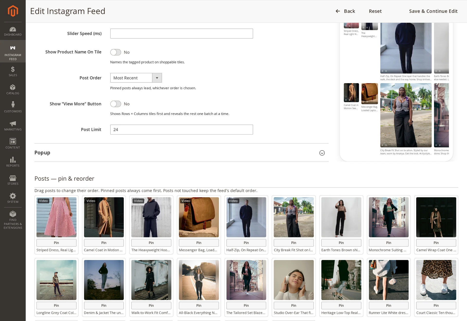
| Setting | Options | Default |
|---|---|---|
| Product Cards | Overlay on the media, Below the media (bottom), Side panel (right), Hidden | Overlay on the media |
| Show Caption | on / off | on with a detail pane |
| Show Date | on / off | on with a detail pane |
| Show Permalink | on / off | off |
| Follow Link Placement | Centred on the media, on hover / In the details bar / Hidden | Centred on the media, on hover |
Brand colours
Layout and spacing are configurable from the admin. Colours, fonts and hover effects are fixed in the module stylesheet today, so brand colours need a CSS override in your theme:
.instagramfeed-follow { background: #your-brand; }
.instagramfeed-title  { font-family: var(--your-heading-font); }
Useful hooks: .instagramfeed, .instagramfeed-title, .instagramfeed-tile, .instagramfeed-caption, .instagramfeed-follow, .instagramfeed-popup.
Layout values also reach the browser as CSS custom properties on the feed container, so your CSS can read them:
--ig-columns-desktop  --ig-columns-tablet  --ig-columns-mobile
--ig-gap  --ig-radius  --ig-aspect-ratio  --ig-min-tile
Admin-configurable colours are planned — see Limitations.